
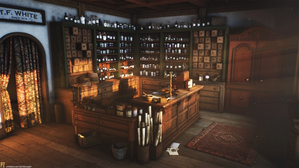
I absolutely love this piece. I really like the old and worn pharmacy type of feeling the artist has created, which was also his goal. The textures look very natural and realistic and give a feeling of the a photograph. In my opinion, however, the bottle lable texture could be improved. The environment gives this old and dusty feeling while the lables seem brand new thanks to which they don’t seem to fit in right.
The placement of the assets seems well-thought of by artist and looks natural in the environment. The modelling work is on point and all the pieces match perfectly together.
I like that the artist has not used any so-called artificial lights, but only a sun light coming through the window. This, too, gives a very naturalistic and a warm feeling.
The composition is good and the one-point perspective guides the to the middle, where the main assets lay. However the light shining through a (probably) window, leads the eye more to the door and I personally would let it shine more on the counter.
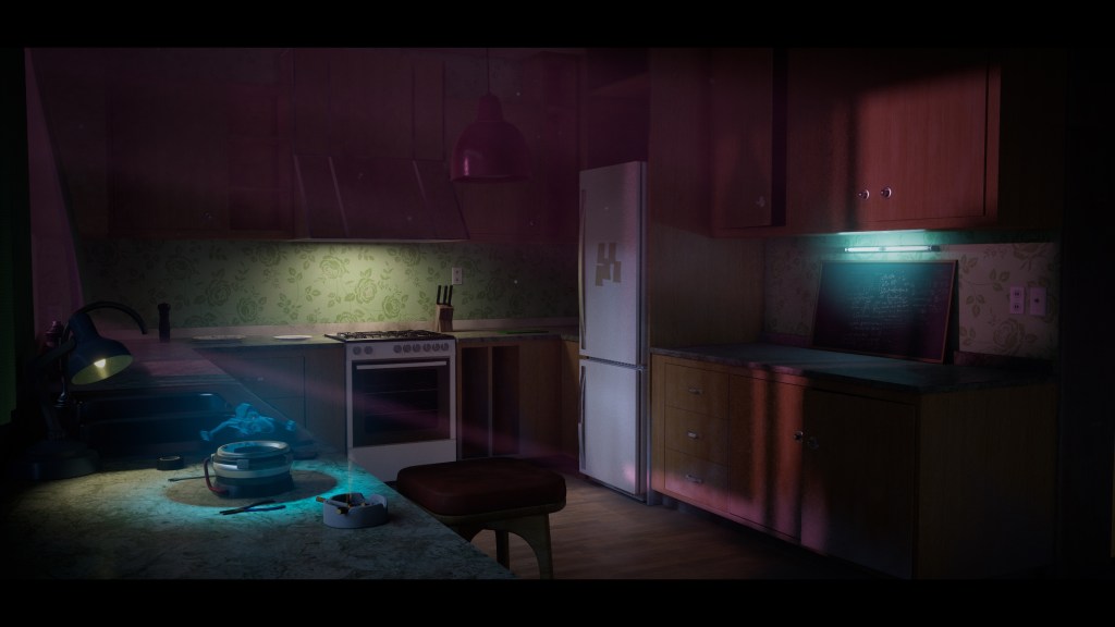
This environment feels very natural and inviting. There is a true “homey” vibe to it. I think the biggest strength to this environment is the use of lighting. The lights are placed in well-thought way and the artist has managed to make the lights look very natural. The lights seem to also work as eye-leading aspects, showing the main areas and assets of the environment. The pinkish light ray coming from the window is one of my favorite parts of the light in the scene.
The color scheme is very strong and the texturing is absolutely amazing. Nothing seems out of place or as if it was modelled, instead it looks like a photograph.
I absolutely love the smoke effect around the cigarette, and the overall foggy atmosphere.
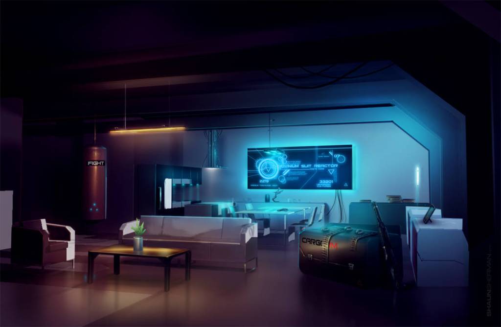
This environment is a great example of a futuristic interior design. The assets created are simple, modern, and futuristic and work well within the created room layout. All the elements fit together with each other except for the military-like black box in the room which seems a bit out of place and would work better in some other environment.
The use of lighting is great and I especially like the soft ceiling lamp over the table that creates this warm and inviting feeling. The two main lights – TV screen and the ceiling lamp – lead the eye to the most interesting and probably most important parts of the environment.
The texturing is really good and looks very realistic.
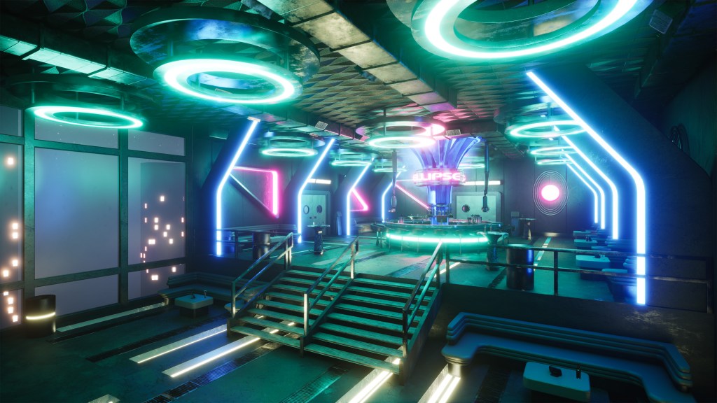
Eric Burr created this indoor game environment project in Unreal Engine 5 and it was inspired by the top of the The Standard Hotel in New York, along with some more futuristic aesthetics. The artist has managed to incorporate futuristic elements to a modern bar very well and the place looks relatively natural design-wise. The use of lighting is great and is a big inspiration for my own indoor environment. He has managed to make the neon lights look very realistic.
The composition and design of the environment looks good and nothing is out of place. The textures fit in and look seamless.
I really like how the all the lines lead to the bar area in the middle.
This environment does look 3D in parts. The floor lights in front don’t seem as realistic as they could, for example. However, realistic or not, I really like this piece and I think the lighting is the strongest part of this piece.
